Branding the now James Beard awarded and Michelin-starred, Galit was about capturing the soul of a restaurant that blends Middle Eastern tradition with a fresh, modern spirit. Chef-owner Zach sought to create a space where guests would feel like they were attending a family dinner party—an inviting, communal experience where the joy of breaking bread together is at the heart of it all. Galit offers an upscale dining experience that remains warm and welcoming, even for families with children.
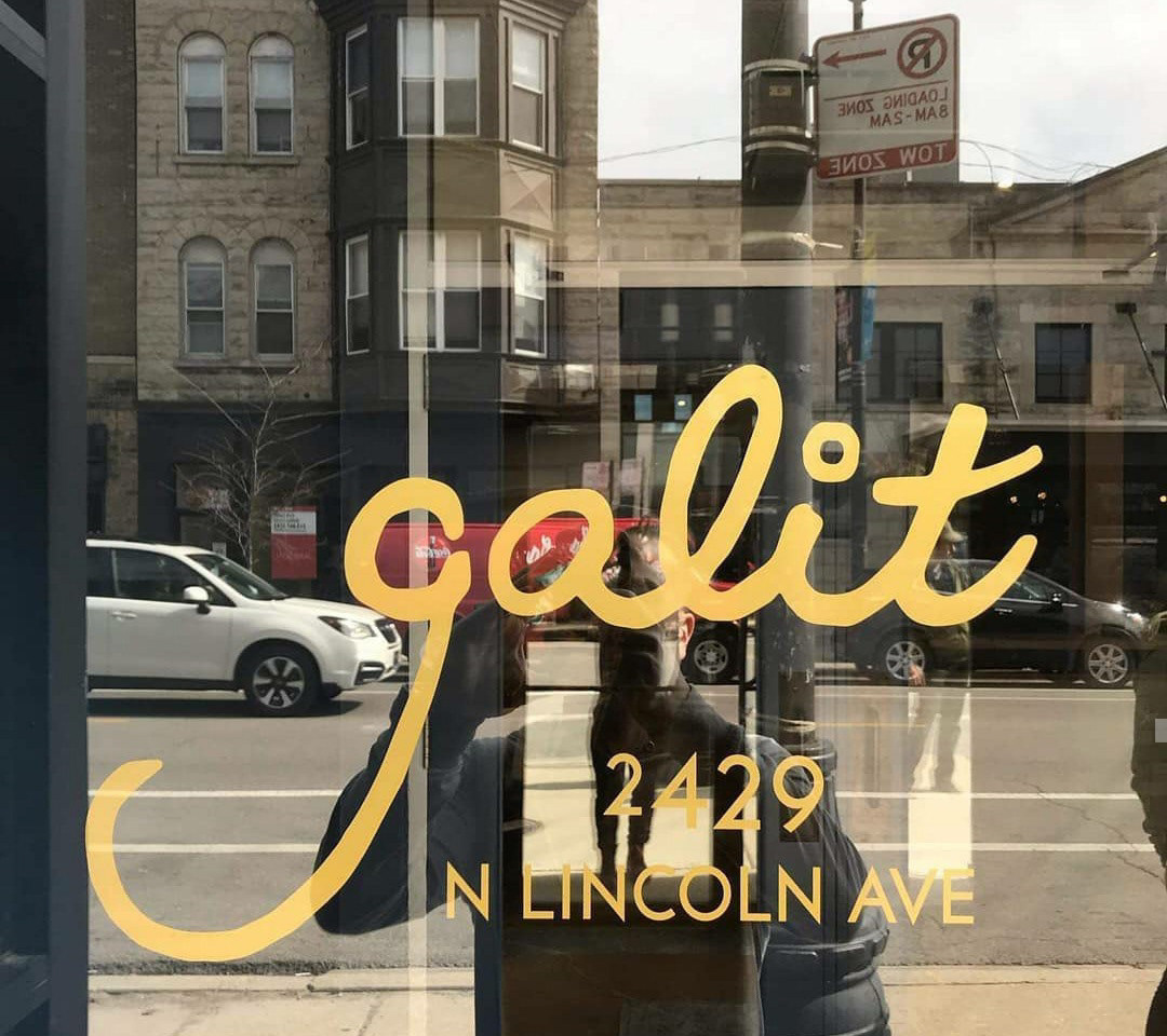
Family became an integral part of Galit’s branding, starting with its name, inspired by Zach’s eldest daughter, Margalit. The logo and typography evoke a childlike energy, while the menu illustrations are reminiscent of Zach’s ketubah, a traditional Jewish marriage contract.
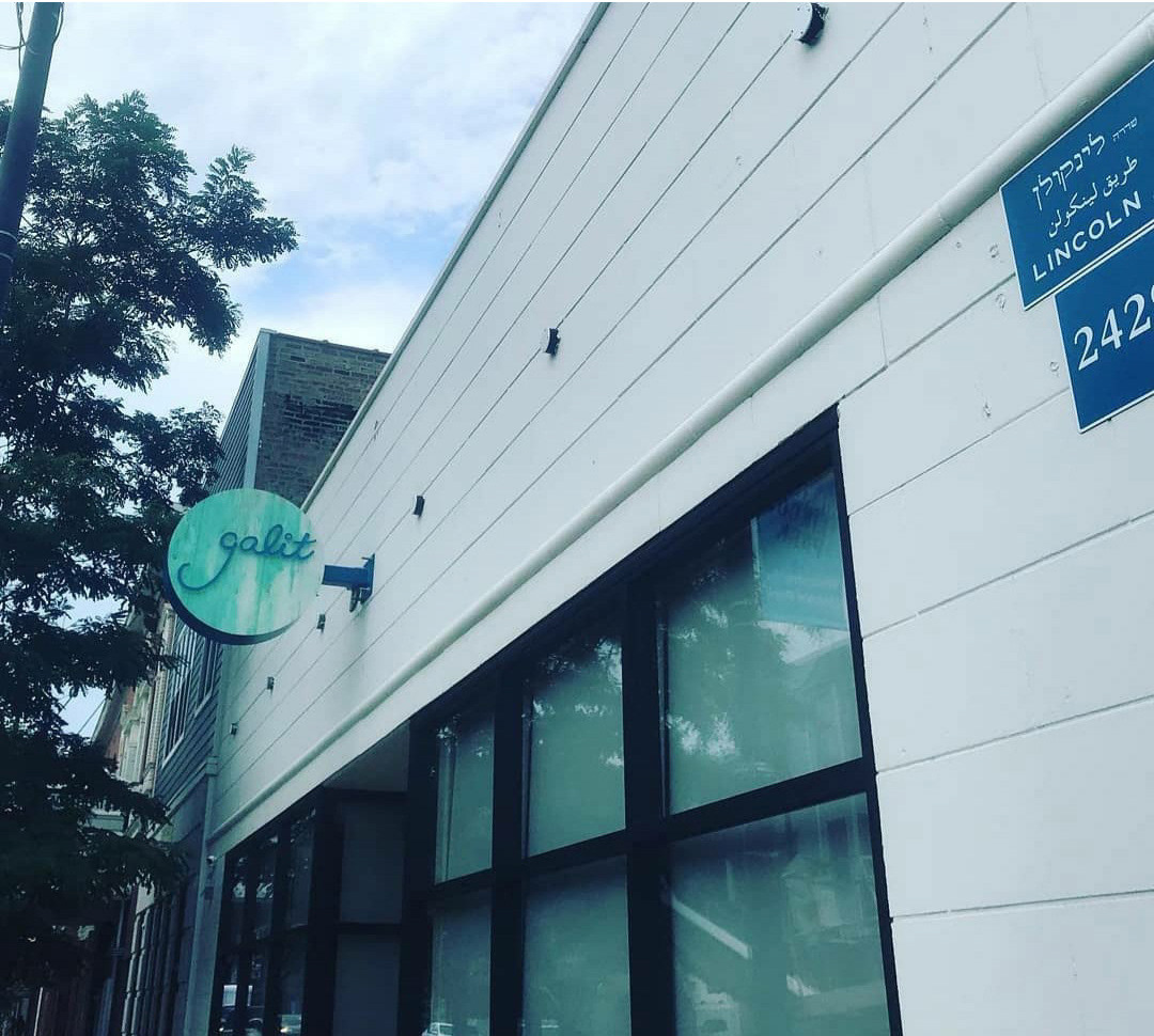
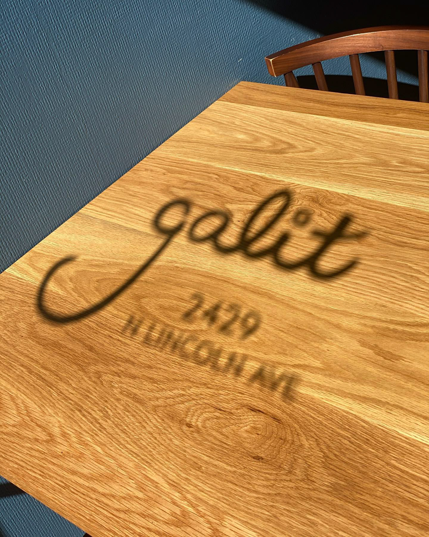
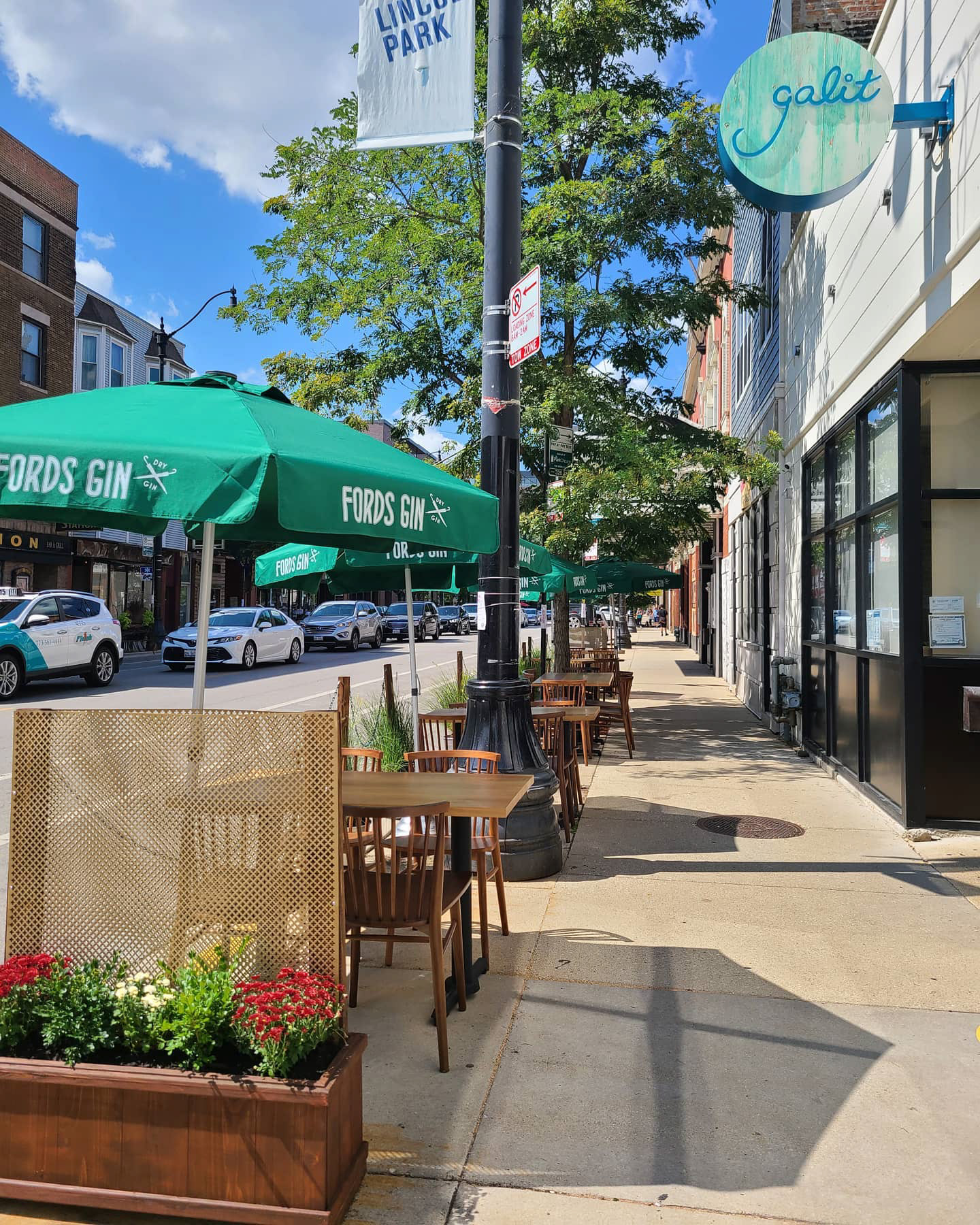
The restaurant’s identity reflects the warmth of fire-kissed flavors, the generosity of shared plates, and the vibrant energy found at dining tables across the Middle East. From typography to color palette, every design choice embodies the essence of Galit—welcoming, rooted in history, yet undeniably contemporary.
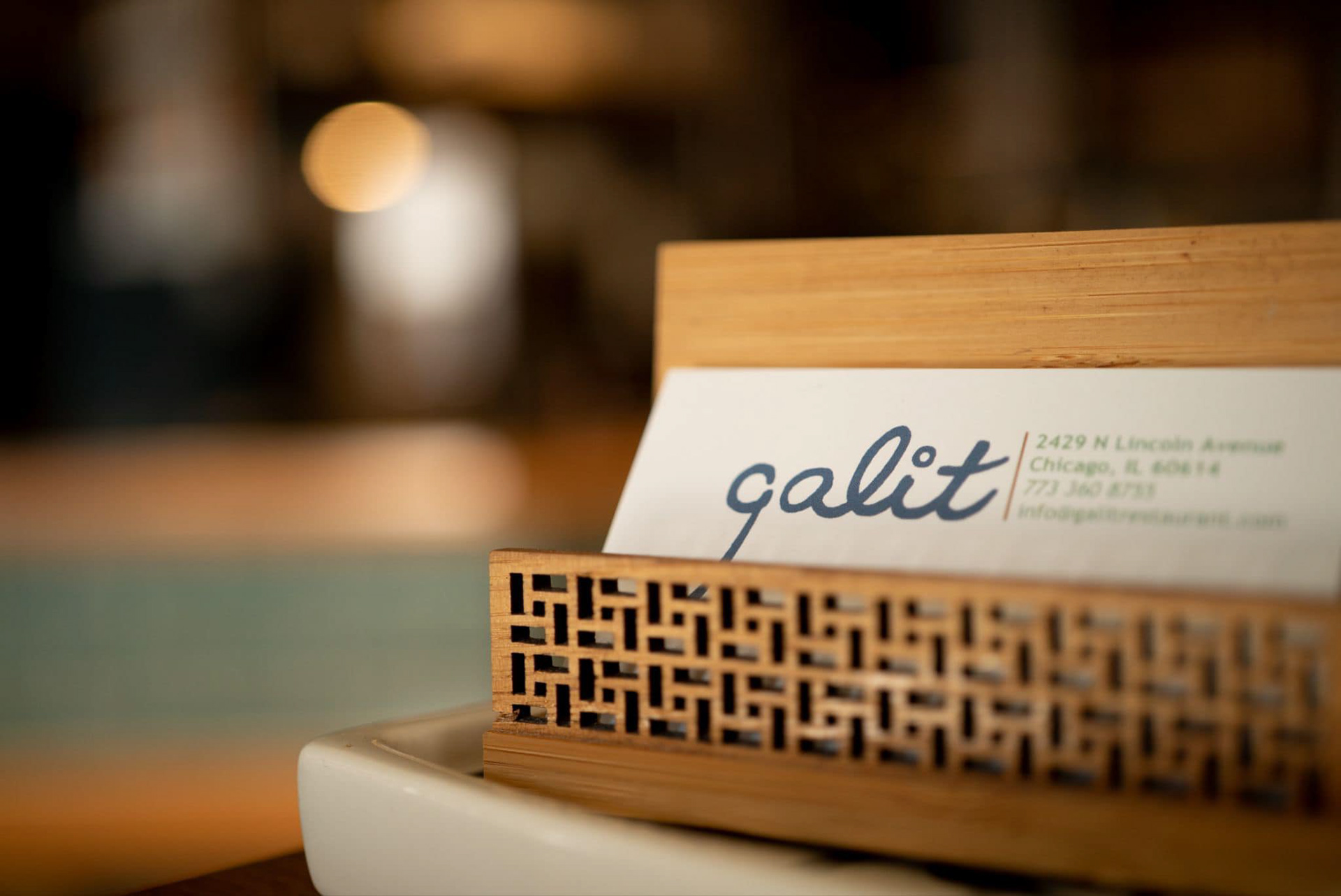
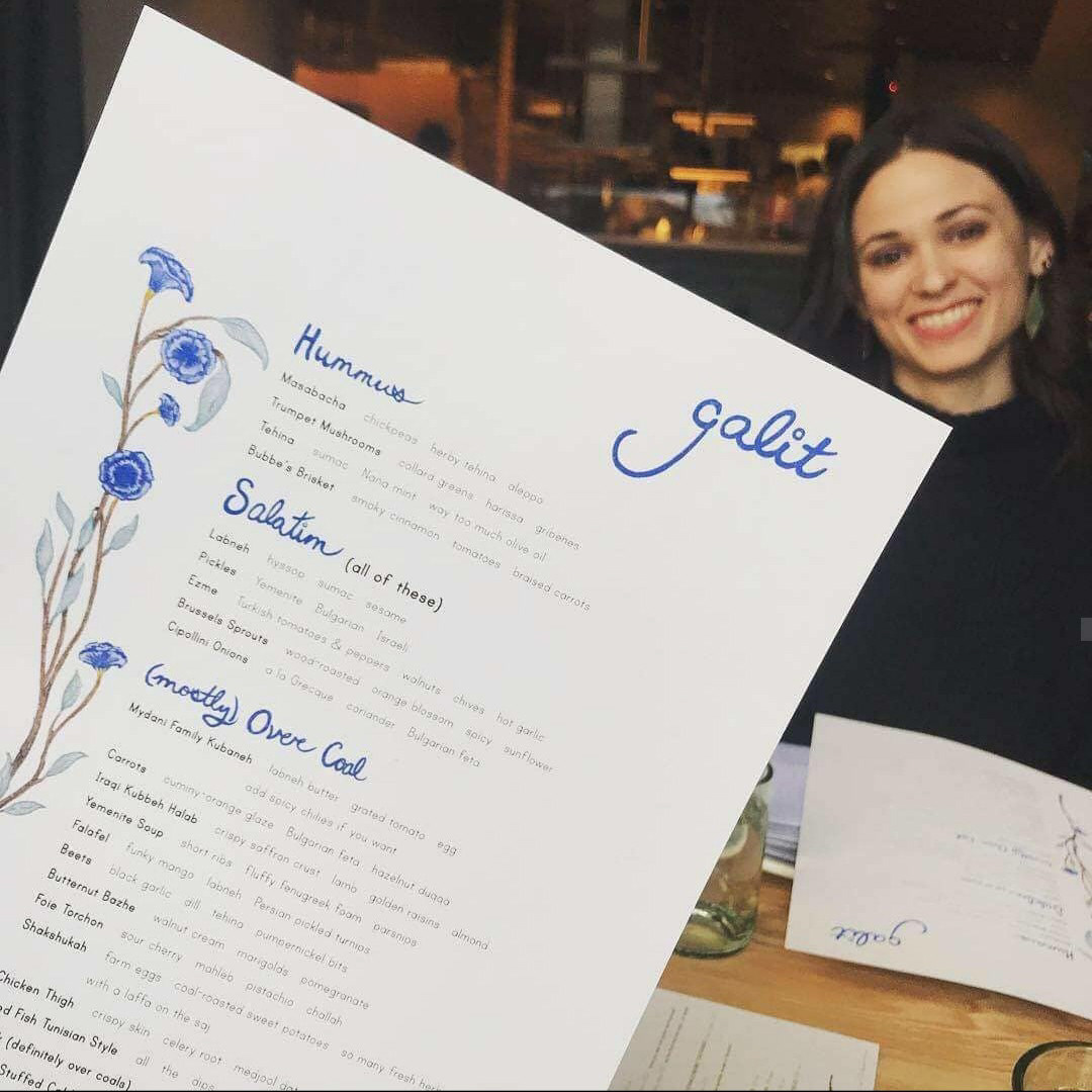


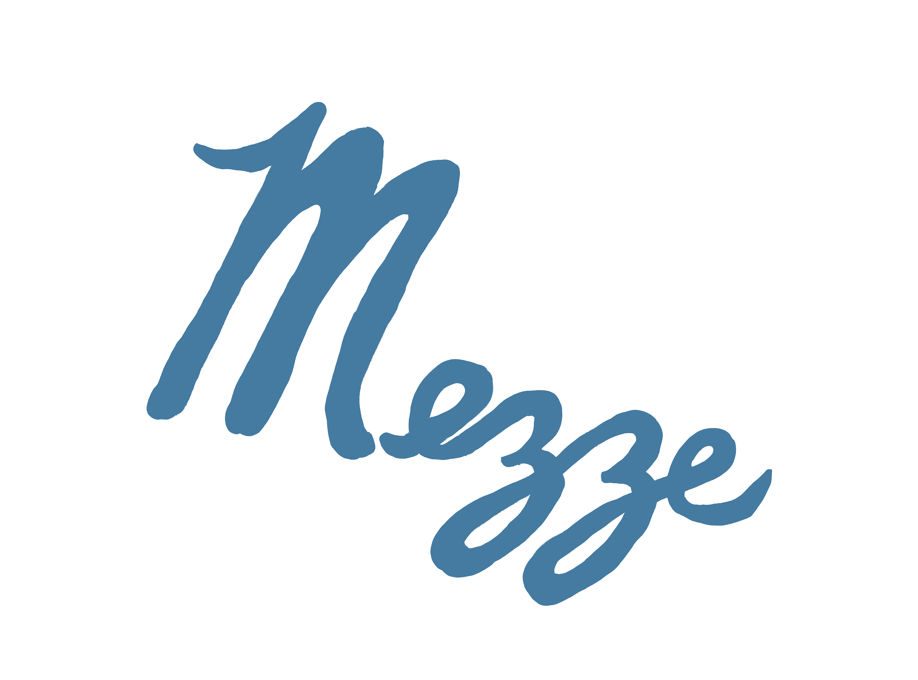
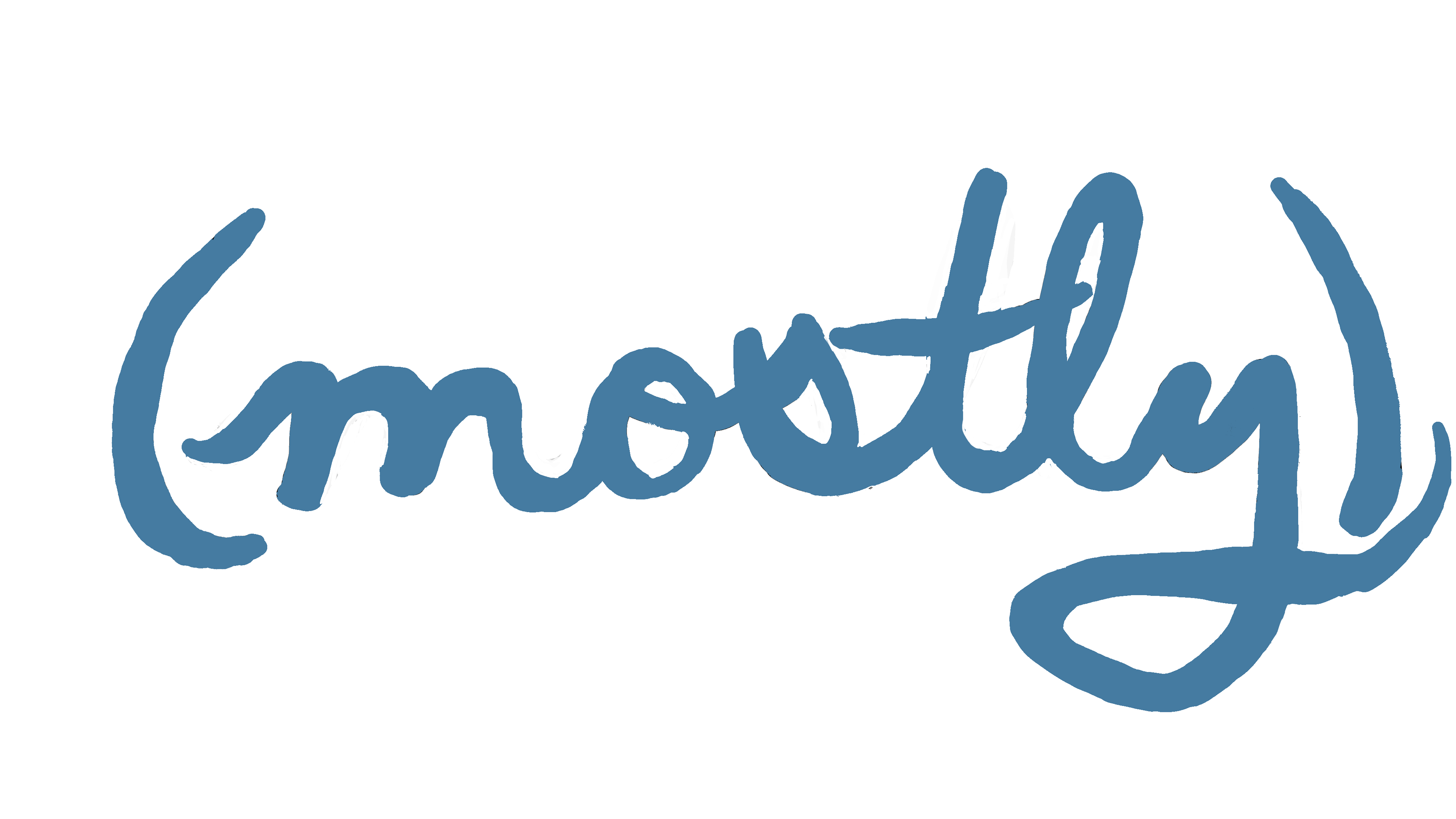


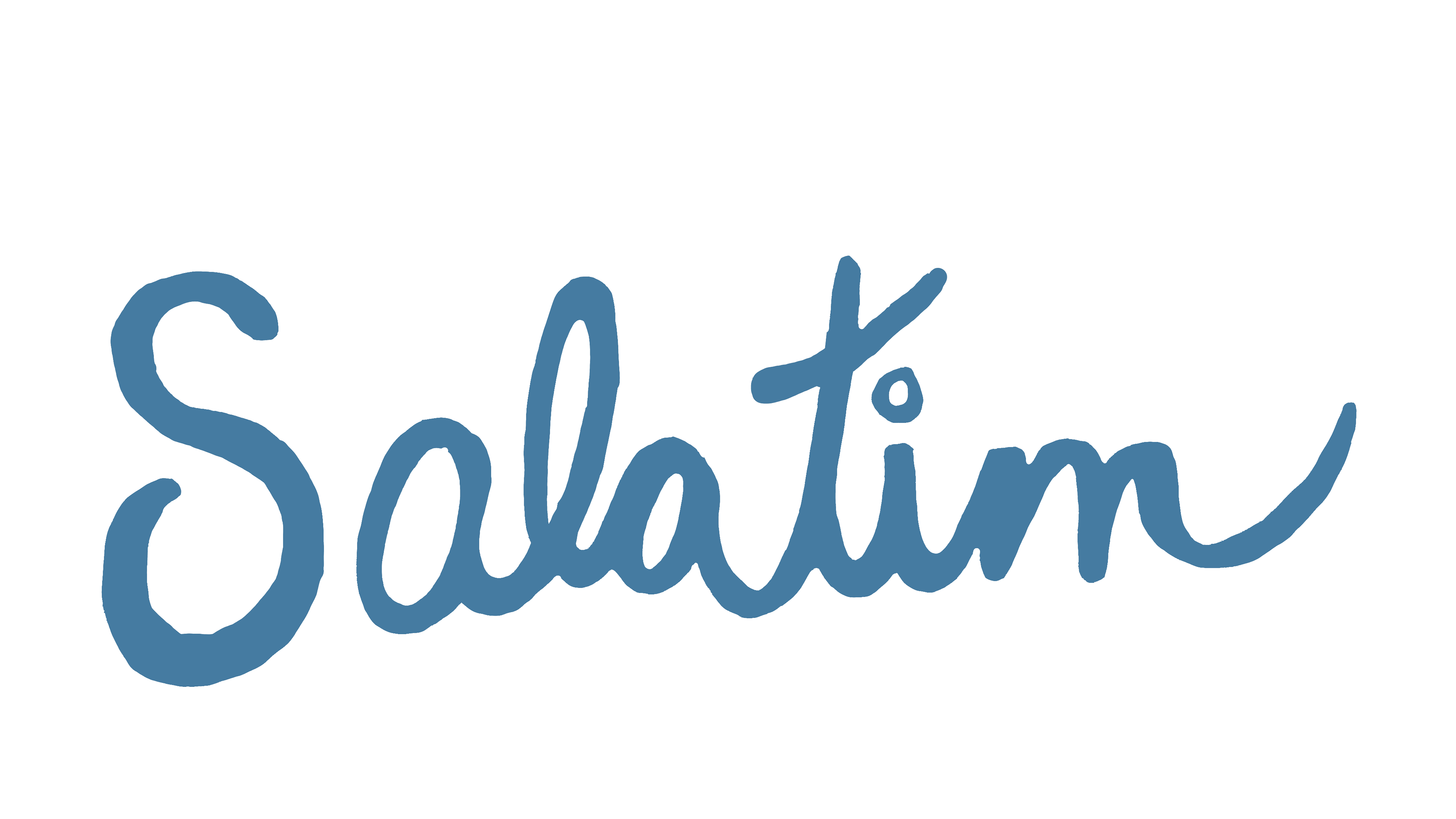
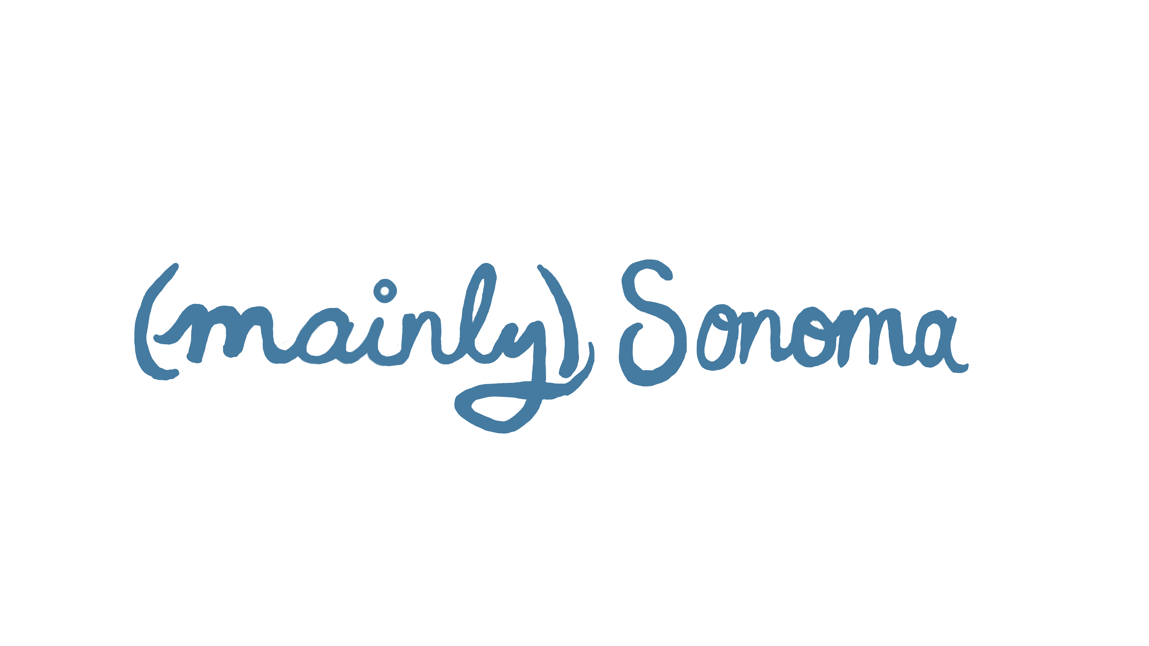


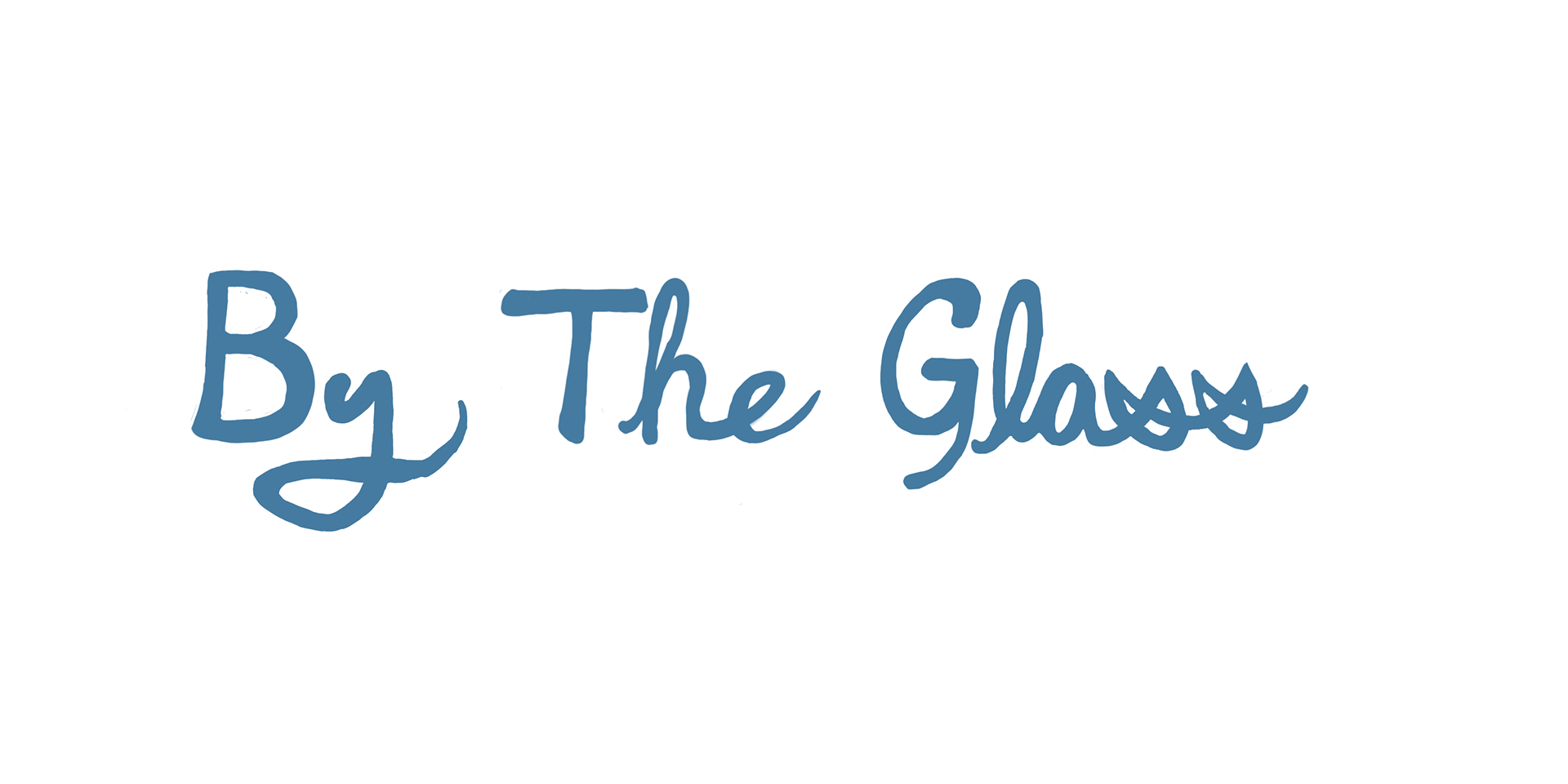


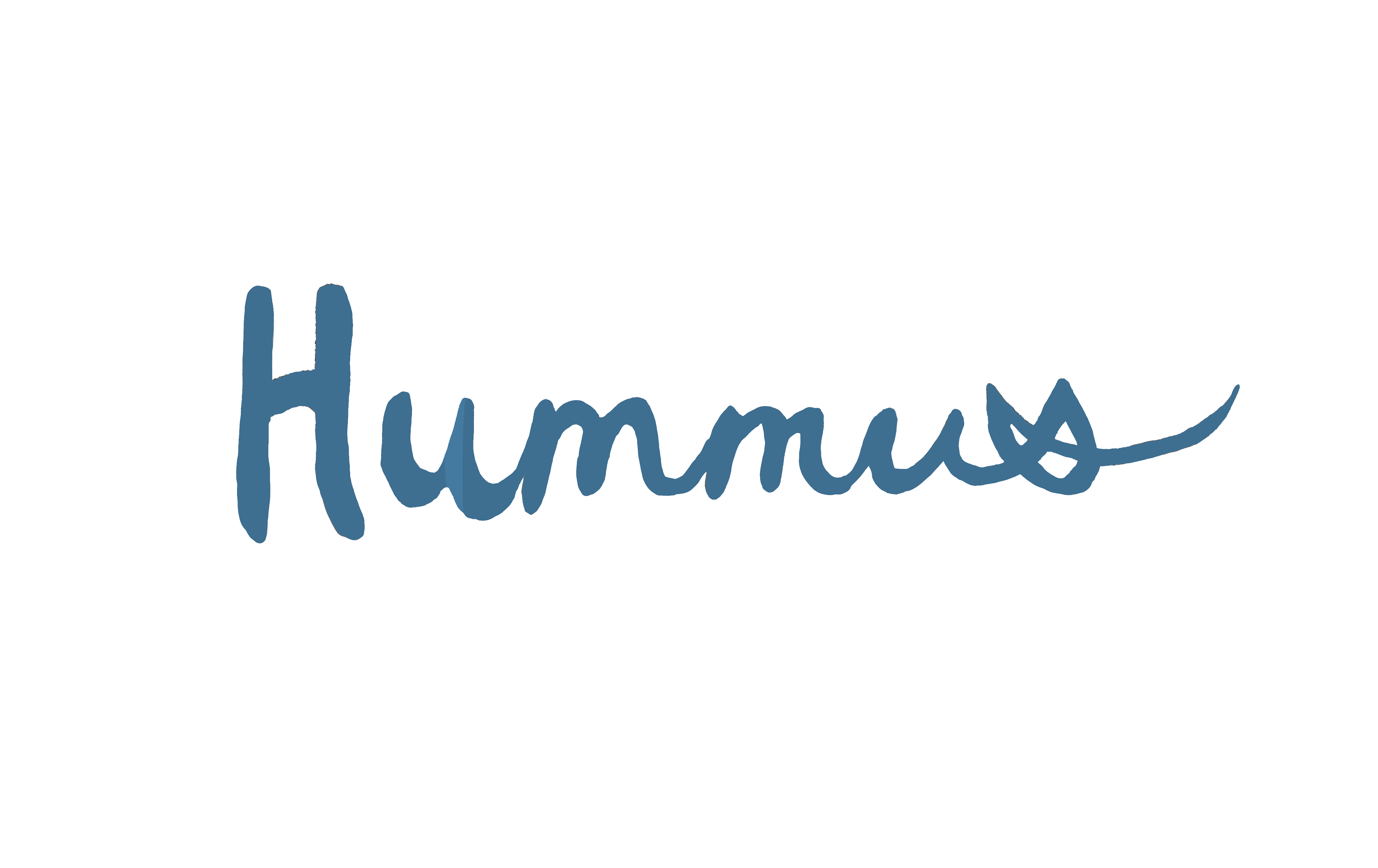
Handrawn font for the Galit Menus
